

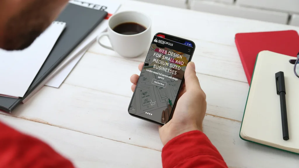
Most people will meet your website on a phone. They’ll be standing at a bus stop, sitting in a café or half-watching the television, and they’ll give it a few seconds to show them what they need. If it doesn’t, they’ll go back to Google and tap the next result.
That’s why we design for the phone first.
What mobile-first actually means
Mobile-first doesn’t mean the desktop version is an afterthought. It means we start with the smallest screen and decide what really matters before anything else gets added.
On a phone there’s room for very little at once. So the first questions are simple. What does someone need to see straight away? What do they need to be able to do? For most small businesses the answer is short: what you do, where you are, and how to call or get in touch.
Once that’s clear on a phone, the larger screens get the extras: bigger images, more detail side by side, room to breathe.
Why it makes a better website everywhere
Designing the other way round, desktop first, usually means squeezing a busy layout onto a small screen later. Menus get crammed, buttons get too small to tap, and important things get pushed down the page.
Starting small forces good decisions:
- Clear priorities. If something isn’t worth space on a phone, it’s worth asking whether it’s needed at all.
- Shorter, plainer words. Long paragraphs are hard work on a phone, so the writing gets tighter. That helps everyone.
- Buttons you can use. Phone numbers you can tap to call, forms that are easy to fill in with a thumb.
- Faster pages. A phone on a patchy signal is the real test. Pages built for that load quickly everywhere.
It also matters to Google
Google looks at the mobile version of your site when it decides how to rank it. A site that works well on phones gives you a better chance of being found.
How we do it
Every website we design starts on a phone-sized screen, and we check each page on real phones before launch. When the site is built, it adapts to every screen in between. That part is responsive design, which we’ve written about in From pixels to perfection: responsive design for every screen.
If your current site is awkward to use on a phone, that’s usually the first thing worth fixing. See how we approach web design, or get in touch for a free chat.