How to Select the Best Colours and Fonts for Your Website: A Guide for Clients
When designing a website, two of the most critical choices you’ll make are selecting the right colours and fonts. These choices go beyond aesthetics—they influence how your audience perceives your brand, how they interact with your content, and ultimately, whether they take action. So how do you choose the best colours and fonts for your website? Let’s break it down.

1. The Power of Colour: Understanding Colour Psychology
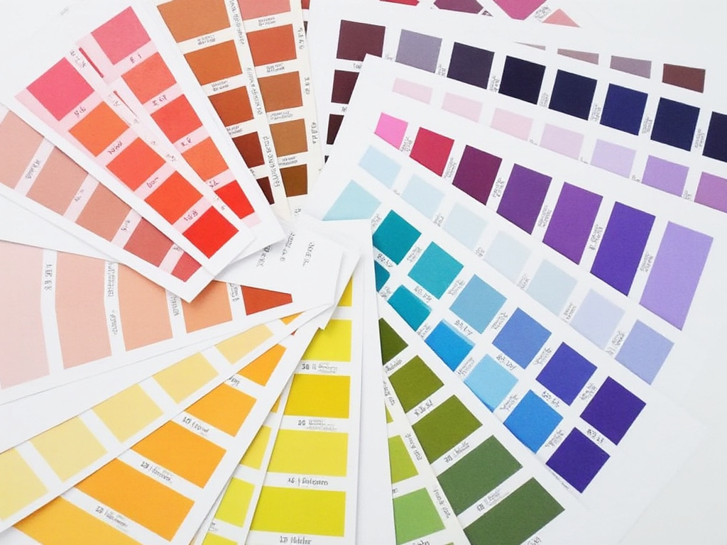
Colours are more than just a design element—they evoke emotions and associations. This is where colour psychology comes into play. The right colour palette can convey your brand’s personality and make your audience feel a certain way. Here’s how some popular colouurs tend to be perceived:
Blue: Trust, calm, professionalism. Many corporate and tech companies (like Facebook and LinkedIn) use blue because it exudes reliability.
Red: Energy, passion, urgency. Red can grab attention and create excitement, which is why it’s often used in sales and promotions.
Green: Growth, health, nature. Brands in wellness or eco-conscious industries gravitate toward green to symbolize balance and renewal.
Yellow: Optimism, warmth, cheerfulness. Yellow evokes positivity, but it should be used sparingly as it can be overwhelming in large doses.
Black: Sophistication, luxury, elegance. Black is a staple for high-end brands as it speaks to sophistication and timelessness.
Tip: Choose colours that resonate with the emotional tone you want your brand to convey. If you’re a financial consultant, for example, calming colours like blue and green might help instill trust. On the other hand, if you’re a children’s toy store, vibrant and playful colours like yellow and orange will appeal more to your target audience.
2. Setting the Mood: Using Colour to Enhance User Experience
Colours don’t just create emotional responses—they also set the mood for your website and guide how users interact with your content. Here are a few factors to consider:
- Contrast for Readability: Make sure there’s enough contrast between text and background colours to ensure readability. Dark text on a light background (or vice versa) tends to work best.
- Highlight Key Elements: Use a bold or contrasting colour to draw attention to call-to-action buttons (e.g., “Sign Up,” “Buy Now”), helping guide users to the important parts of your site.
- Consistency Across Pages: Keep your colour scheme consistent throughout your website. Too many variations can be distracting and make your site feel disjointed. Stick to a primary colour palette (two to four main colours) and use accent colours sparingly.
Tip: The colours you use should complement your brand’s overall identity. If your company’s logo is green, use different shades of green in your website to maintain brand consistency.

3. Choosing the Right Fonts: Why Fonts Matter
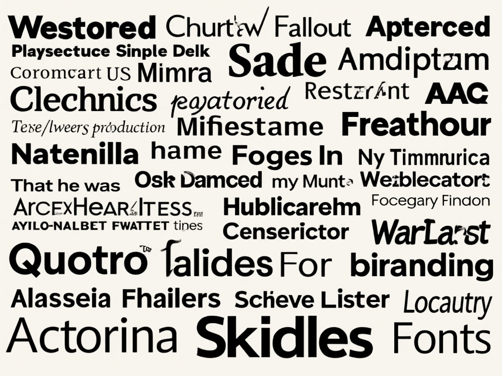
Just like colours, fonts can influence how people feel about your brand and interact with your content. Fonts communicate more than words—they communicate tone. Choosing the right font ensures your message is clear and aligned with your brand identity. Here’s why it matters:
Readability and Accessibility: A fancy, elaborate font might look great in a logo, but it could be difficult to read on a web page. Legibility is key. Stick to fonts that are easy to read across all devices—whether it’s a desktop, tablet, or smartphone.
Reflecting Your Brand’s Personality: Fonts have personalities. A clean, modern sans-serif font like Helvetica conveys professionalism and simplicity, whereas a serif font like Times New Roman gives a more traditional, formal vibe. Bold, handwritten fonts can express creativity and playfulness, making them perfect for artistic or personal brands.
Consistency and Hierarchy: Just like with colours, it’s important to use fonts consistently throughout your website. Use one font for headings and another for body text, but limit the number of different fonts to two or three to keep your design cohesive. Establishing a clear hierarchy through font size and weight helps guide users through the content and draws attention to what’s most important.
Tip: Test different fonts with your audience. What feels right for one industry might not work for another, so consider who your audience is and what style would most resonate with them.
4. Bringing It All Together: Consistency is Key
While colours and fonts are important individually, it’s the consistency in their use that creates a polished and professional website. Consistent colour palettes and fonts across your website ensure a seamless user experience and reinforce your brand identity. When users visit your site, they should instantly recognize your brand’s personality through its design.
Here’s how to maintain consistency:
- Stick to the same primary and secondary colours across your pages.
- Use the same fonts for headings, subheadings, and body text.
- Apply a consistent style for buttons, links, and other interactive elements.
By doing so, you create a cohesive experience that strengthens your brand and builds trust with your visitors.
Conclusion: The Art of Choosing Colours and Fonts
Selecting the best colours and fonts for your website is about more than just personal taste. It’s about creating the right emotional impact, mood, and consistency that align with your brand’s goals. A thoughtful colour palette and the right fonts will set the tone for your website, engage your audience, and help communicate your brand’s message effectively.
If you’re unsure where to start or want to ensure you’re making the right design decisions, reach out to us at Metropolis Web Design! We’re here to help you create a website that not only looks amazing but also works to build trust and attract your ideal clients.
